Badge
EuiBadge highlights key pieces of information. While badges will space themselves automatically when used repeatedly, it's best practice to wrap them in an EuiBadgeGroup. This ensures they wrap properly when space is limited (as shown below).
Components
Default
Notification badge
EuiNotificationBadge should be used to showcase the number of notifications, alerts, or hidden selections. This badge type is commonly used in the EuiHeader and EuiFilterButton components.
Beta badge
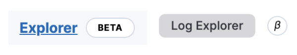
The EuiBetaBadge was created specifically to call out modules that are not in GA. Generally the labels used are "Beta" or "Lab". They require an extra tooltipContent to describe the purpose of the badge. You can pass an optional title prop to populate the tooltip title or html title attribute but by default it will use the label.
If you pass in an iconType, only the icon will be used in the badge itself and the label will be applied as the title. Only use an icon when attaching the beta badge to small components. Beta badges can also be made clickable by passing href or onClick as needed.
They can also be used in conjunction with EuiCards and EuiKeyPadMenuItems.
Usage
Color options
Badge colors can be configured with the color prop
and the related fill prop.
When a named color like primary is passed to the color prop, the fill prop
determines whether the badge will use filled (more intense) or non-filled
(less intense) colors. By default, all badges use non-filled colors.
Badge with Icon
Badges can use icons on the left and right (default) sides.
Badge with onClick events
Badges can have onClick events applied to the badge itself or the icon within the badge. The latter option is useful for when you might use badges in other components (like a tag system with autocomplete where you need close events).
onClick with iconOnClick
When providing both these click handlers, EuiBadge must alter the contents so that it does not contain nested button tags. Please make note that if you provide props other than those explicit to EuiBadge, they will always be applied to the main button tag which may be inside of the outer most tag.
Badge for health status
Badges can work as health status indicators in places where there are a lot of repeated statuses, e.g. in tables.
Badge with href
Badges can also be made to render anchor tags by passing an href.
Badge groups and truncation
Badges, like buttons, will only every be a single line of text. This means text will not wrap, but be truncated if the badge's width reaches that of its parent's.
For this reason, badges also auto-apply the inner text of the badge to the title attribute of the element to provide default browser tooltips with the full badge text.
To ensure proper wrapping, truncation and spacing of multiple badges, it is advisable to wrap them in a EuiBadgeGroup.
Guidelines
Using badges in the interface allows to indicate upcoming features and product innovations available for testing and to set user expectations about the maturity, (non-)support, and stability of a feature.
Choosing pre-GA badges
When a feature becomes available for users before being officially Generally Available (GA), it is marked using a badge. A badge can have a default and a short form (with a simple icon). With both forms, a tooltip text explains what this means for the feature to help users get the correct expectations.
Features don't necessarily go through each stage defined in this document. For example, it can start with Beta, or it can start with Technical preview and be announced as GA next.
Such badges rely on the Beta badge EUI component.
Stage | Technical preview | Beta | GA |
|---|---|---|---|
Description | Experimental features that may not be kept or that may change fundamentally. | Features nearing GA that are not expected to fundamentally change for GA. | Features that are officially supported for production usage. |
Default label | TECHNICAL PREVIEW | BETA | N/A |
Short label For navigation and contextual menus | N/A | ||
Tooltip | This functionality is experimental and not supported. It may change or be removed at any time. | This functionality is still under development and not ready for production usage. | N/A |
User expectations and perception | Unstable. For testing an innovation. Bugs and breaking changes are perceived as normal. | Fairly stable. For evaluating or testing an awaited feature. The feature is almost ready. There might be some bugs and UX/API refinements. | Production-ready. The feature is ready for production workloads. |
Props
EuiBadge
Prop | Description and type | Default value |
|---|---|---|
Prop iconType# | Description and type Accepts any string from our icon library IconType | Default value |
Prop iconSide# | Description and type The side of the badge the icon should sit "left" | "right" | Default value left |
Prop color# | Description and type Accepts either our palette colors (primary, success ..etc) or a hex value string | Default value default |
Prop fill# | Description and type Whether the badge should use filled (more intense) colors. boolean | Default value false |
Prop isDisabled# | Description and type Will override any color passed through the boolean | Default value |
Prop closeButtonProps# | Description and type Props passed to the close button. Partial<Omit<EuiIconProps, "stylesMemoizer"> & RefAttributes<unknown>> | Default value |
Prop className# | Description and type Type: string | Default value |
Prop aria-label# | Description and type Defines a string value that labels the current element. string | Default value |
Prop data-test-subj# | Description and type Type: string | Default value |
Prop css# | Description and type Type: Interpolation<Theme> | Default value |
Prop iconOnClick# | Description and type Will apply an onclick to icon within the badge MouseEventHandler<HTMLButtonElement> | Default value |
Prop iconOnClickAriaLabel# | Description and type Aria label applied to the iconOnClick button string | Default value |
Prop target# | Description and type Type: string | Default value |
Prop href# | Description and type Type: string | Default value |
Prop onClick# | Description and type Will apply an onclick to the badge itself MouseEventHandler<HTMLButtonElement> | Default value |
Prop onClickAriaLabel# | Description and type Aria label applied to the onClick button string | Default value |
EuiBadgeGroup
Prop | Description and type | Default value |
|---|---|---|
Prop className# | Description and type Type: string | Default value |
Prop aria-label# | Description and type Defines a string value that labels the current element. string | Default value |
Prop data-test-subj# | Description and type Type: string | Default value |
Prop css# | Description and type Type: Interpolation<Theme> | Default value |
Prop children# | Description and type Should be a list of ReactNode | Default value |
Prop gutterSize# | Description and type Space between badges "s" | "xs" | "none" | Default value xs |
Prop ref# | Description and type Allows getting a ref to the component instance. LegacyRef<HTMLDivElement> | Default value |
EuiNotificationBadge
Prop | Description and type | Default value |
|---|---|---|
Prop children# | Description and type ReactNode to render as this component's content ReactNode | Default value Required |
Prop size# | Description and type Type: "s" | "m" | Default value s |
Prop color# | Description and type Type: "subdued" | "accent" | "success" | Default value accent |
Prop className# | Description and type Type: string | Default value |
Prop aria-label# | Description and type Type: string | Default value |
Prop data-test-subj# | Description and type Type: string | Default value |
Prop css# | Description and type Type: Interpolation<Theme> | Default value |
EuiBetaBadge
Prop | Description and type | Default value |
|---|---|---|
Prop label# | Description and type One word label like "Beta" or "Lab" string | number | boolean | ReactElement | Iterable<ReactNode> | ReactPortal | (ReactElement<...> & string) | (Iterable<...> & string) | (ReactPortal & string) | Default value Required |
Prop className# | Description and type Type: string | Default value |
Prop aria-label# | Description and type Defines a string value that labels the current element. string | Default value |
Prop data-test-subj# | Description and type Type: string | Default value |
Prop css# | Description and type Type: Interpolation<Theme> | Default value |
Prop title# | Description and type Optional title will be supplied as tooltip title or title attribute string | Default value |
Prop target# | Description and type Type: string | Default value |
Prop href# | Description and type Type: string | Default value |
Prop onClick# | Description and type Will apply an onclick to the badge itself MouseEventHandler<HTMLButtonElement> | Default value |
Prop onClickAriaLabel# | Description and type Aria label applied to the onClick button string | Default value |
Prop iconType# | Description and type Supply an icon type if the badge should just be an icon IconType | Default value |
Prop tooltipContent# | Description and type Content for the tooltip ReactNode | Default value |
Prop tooltipPosition# | Description and type Custom position of the tooltip ToolTipPositions | Default value top |
Prop anchorProps# | Description and type Passes onto the span wrapping the badge CommonProps & HTMLAttributes<HTMLSpanElement> | Default value |
Prop color# | Description and type Accepts accent, subdued, hollow and warning. "subdued" | "accent" | "warning" | "hollow" | Default value hollow |
Prop size# | Description and type Type: "s" | "m" | Default value m |
Prop alignment# | Description and type Sets the "baseline" | "middle" | Default value baseline |