Form layouts guidelines
Be sure to read the full forms usage guidelines.
This page documents patterns for form layout, validation and how best to use various components.
Key Principles
Help users achieve success
Our form components try to be as informative and clear as possible for the user to avoid errors or confusion.
Use labels and descriptions
Use a label (and description if needed) for each form field. All form fields should be considered required unless stated alongside the label.
Provide help text
Show validation parameters in the help text below the input. For example: Spaces and special characters are not allowed.
Validate on blur
Validation should occur on blur from an input field. The submit button should be active by default, then show errors after click. Error messages should be specific to the situation.
Provide transparency
It should be clear to users what they can accomplish in each part of the form.
Layout matters
A well-formatted layout makes it clear to users how to navigate the form. As one field is completed, it should be clear where to go next.
Words matter
Form labels and descriptions are equally important as layout and should be treated with just as much care. The text should be specific, concise, and easy to scan.
Described form rows
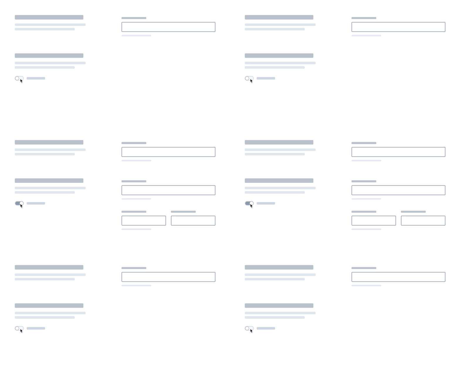
An EuiDescribedFormRow provides an additional heading along with description text for a single input or set of input fields.

When to use it
This component is not intended for every type of form, but typically works best in the following scenarios.
Forms with lengthy descriptions per input
If a longer description is needed, use an EuiDescribedFormRow to divide the form into a column for descriptions and a column for form fields. This is so there is space for descriptions to aid new users, but keeps the form fields in a column, so frequent users can still quickly navigate the form. Try to limit the description to three sentences or less.
Forms with multiple inputs falling under a single heading
If multiple sub-steps are needed, grouping them together using an EuiDescribedFormRow helps show they are all still related.
Forms with complex nested options
An EuiDescribedFormRow is useful when there are parts of the form that can be hidden and shown by the user. The toggle to hide and show the row should be beneath the description and the following form fields should be in the right column with the other form fields.
Maintain a standard layout
Keep the form divided into two columns, with the descriptions on one side and form fields on the other.
Do. To make groupings clearer and keep the user's eye in one path, it's better to keep inputs in a single column. If multiple fields are needed, they should still remain within the column.
Don’t. Avoid nesting form rows. It creates an uneven path for the user's eye to travel down the form.
Divide the form into sections
As a form grows longer, it's best to divide the form into sections. This helps the user quickly scan the form and provides visual breaks between multiple input fields.
Do. Adding visual indicators can help clearly define the sections of the form.
Don’t. Using panels within panels creates too much visual noise and can make it confusing where sections begin and end.
Do. Add more spacing between form groups than fields within the group to better define the grouping.
Don’t. Avoid using the same spacing between groups and individual fields. It is harder for the user to scan and understand the sections of the form.
