Metric chart
The Metric chart is a single value visualization available from
Elastic Charts. It allows you to represent a metric, a KPI, a specific state with a very simple interface, similar to EuiStat but with more data visualization oriented capabilities.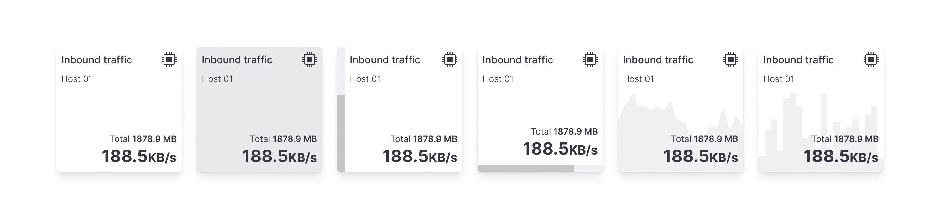
Anatomy
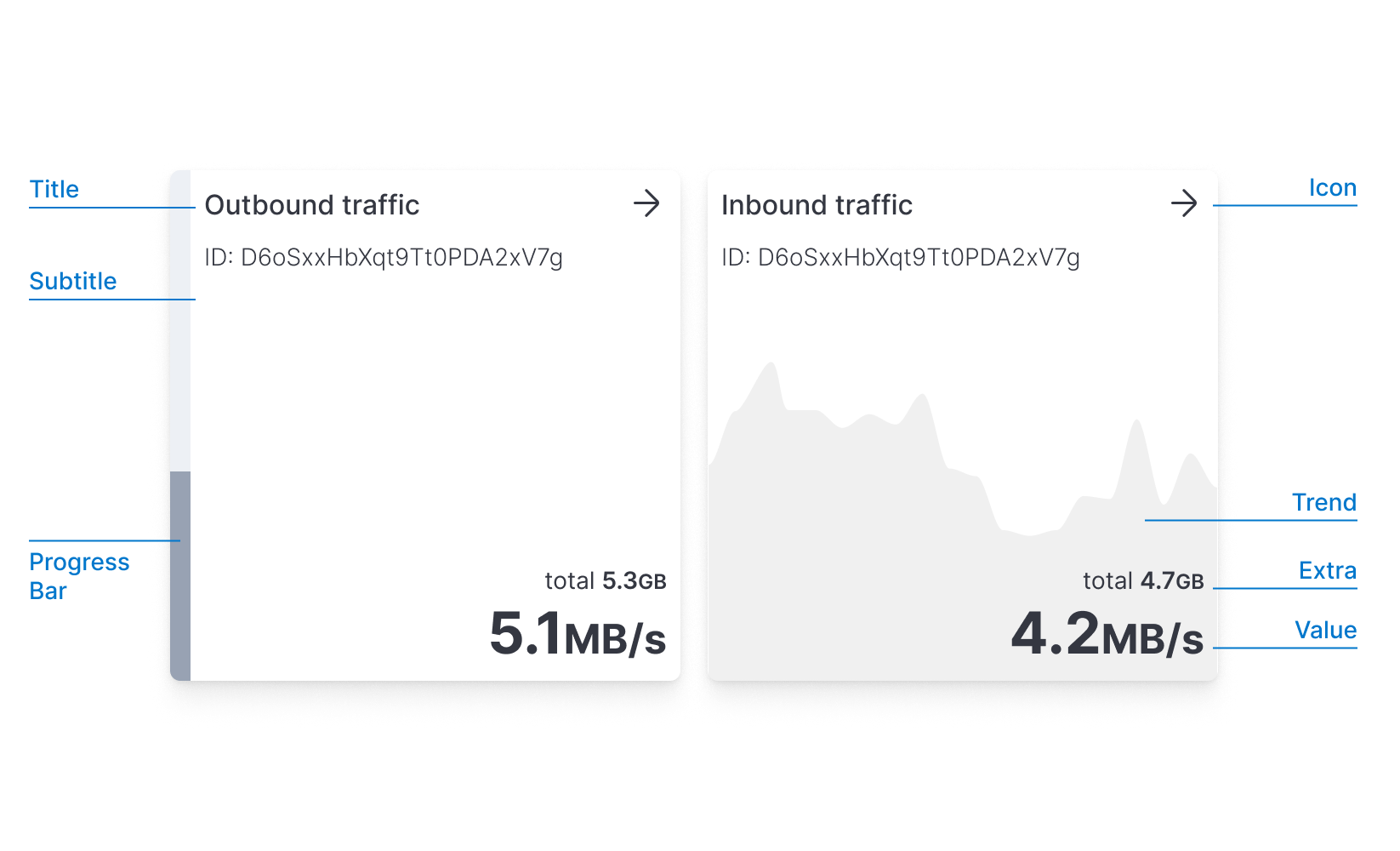
The Metric is used to convey a single numerical value. It usually can represent a specific indicator like: the current CPU value or the number of logs ingested in the last minute. Used correctly, can be very effective represent an overall status.
Some of the questions answered by this chart can be:
- How many visitors are online now?
- What's the current usage of CPU and Memory?
- How many flights have been delayed in the selected time range?
The value can be associated with a secondary visual representation that takes place in the background (like a progress bar or a trend), providing a contextual information layer.
Decorations
These secondary visual representations should be considered decorations. They cannot coexist at the same time (progress bar and trend) to limit the visual complexity and improve the understandability of the data
When to use
It can convey quantitative information such as plain numbers, counts of elements (visitors, flights, etc), percentages and formulas (sum, average, etc).
A qualitative value can be described through a plain background color, or even better through a progress bar.
When using this chart the used text, title, and subtitles should be clearly described and self-explanatory, try to be specific without being too verbose. Longer text or very precise multi-digit numbers can nullify the scope of the chart. You can use subtitles or Unit Text to clarify this and to inform the user of the choices and calculations that have been made prior.
Single value
As described above, the Metric can represent just a single value.
A
valueFormatter is required to format the value.
Is important to limit the number of digits to the right amount depending on your use case. Given a 7 digits number, for example, $3,364,726to represent the current company is a detail that can be reserved for tables. In this case, you probably just need to represent the overall magnitude, so reducing it to 4 digits plus a suffix could suffice $3.365M.
The color attribute can be used to render a color background. Such color can be used for two reasons: aesthetic or functional. In the functional one you can associate a color scale, which depends on your value range, to give a qualitative indicator of your value in that range.
If the passed value is a Number then you must provide a valueFormatter, if instead is a String then the valueFormatter is not required.
Progress bar
The metric can also represent a progress or a quantity within a range. This embellishment improves the context and increases the readability of the data.
The length of a bar is one natural representation of progress. To simplify the readability of the length, the bar always starts at zero.
Zero baseline
The zero baseline constraint is a constraint that we already know from bar charts: when the length of the bar is not proportional to the value it represents it becomes hard to discern that quantity. If you are thinking of using a non-zero baseline (not available in the Metric) try to reconsider the problem by considering the bar as the increment/decrement of the value with respect to a non-zero baseline like revenue change from the past year, or how many degrees above the normal body temperature. Consider also that the absence of a visual scale with numerical references makes the bar abstract and should be immediately clear what it represents.
Negative values
If your metric chart could display negative values (such as temperature, variations in time, YTD losses..) please be aware of this limit and the inner complexity that derives from negative values in such a simple component, please consider adding visual guidance (use an icon to highlight, for instance) to facilitate the user in understanding what is happening.
To use this progress bar, your data should adhere to the MetricWProgress type. In particular, in addition to the already required properties you have to specify the maximum value the progress bar can reach through the domainMax prop and you have to specify a progress bar direction via progressBarDirection.
Trend
A metric usually represents a statistic of a variable in a time frame. To add a bit more context is possible to represent the trend of that variable over time, by plotting an overlay on the metric background.
To achieve that, the trend needs to be filled with an array of objects in the form of {x: number, y: number}
The trend is then rendered following these principles:
- the vertical height represents the range from 0 to the maximum
yvalue. - the horizontal space represents the range from the minimum to the maximum
xvalue - the trend height is limited to 50% of the overall Metric height, so the maximum
yvalue always touches the vertical middle of the metric chart.
Multiple metrics
Metric can live alone or be rendered in a grid. To support this, the data prop is structured to accept an Array of Arrays representing respectively columns and rows of a grid. In this way you can build:
- a single row of multiple metrics using
[[{col1}, {col2}, {col3}]] - a single column of multiple metrics using
[[{row1}], [{row2}], [{row3}]] - a grid column ✕ rows of multiple metrics using
[[{col1row1}, {col2row1}], [{col1row2}], [{col2row2}]]
Multiple horizontal metrics
Providing the following data structure data={[[{col1}, {col2}, {col3}]]}you will get an horizontally aligned set of metrics
You can align vertically the progress bars' directions to compare values using LayoutDirection.Vertical
Multiple vertical metrics
Providing the following data structure data={[[{col1}], [{col2}], [{col3}]]}you will get an vertically aligned set of metrics
You can align horizontally the progress bars directions to compare values using LayoutDirection.Horizontal
Grid
You can mix columns and rows in the data array to create a grid. The grid is filled with missing tiles to cover the last grid row. If you want to skip a tile, you can pass an undefined datum as an element of the array.
Different types of metrics can be mixed together.
Resizing
The Metric chart will take the parent height or width if those are fixed. If not you can still specify a fixed size for the component by constraining the size from the Chart component.
There is no minimum size for this component even though since font sizes do not scale according to size but only according to specific breakpoints, you might encounter a few problems if you work with large numbers at really small sizes.
Metric charts are composed of a series of elements that follow a specified hierarchy. When resizing vertically, it might occur that there is not enough room to place all of them within the component. If that happens, automatically these elements get hidden starting from the least important to the most important. title and value will never be hidden.
Below certain breakpoints, secondary elements such as subtitles are removed in order to leave as much space as possible for primary elements (title, value). Be aware of this limitation when dealing with small metrics.
Please be always aware of this limit and resize the Metric component accordingly within your interface or dashboard.
No Data
Various situations could lead to an uncertain state. We designed two empty states that should cover most of those cases:
- When an applied filter makes the metric incomputable (missing values in a windowed function, or filtered out values for a percentage calculation), then a
NaNcan be sent as thevalue. This will result in rendering aN/Astring, making clear that the chart is working but is not possible to compute the metric correctly. - If, instead, the metric itself is filtered out (for example the metric represents a specific category, that is filtered out) the component won't be rendered, and an empty box is rendered.
Alternatives and similarities
Don't rely solely on the background trend-line to provide a precise and understandable analysis of data trends. These options give a contextual and wider layer of information that could help in understanding the overall trends and evolution of data but they are not detailed enough to get specific insights.
If your goal is to precisely see the evolution of values over time please use a line chart instead, where you'll have all the information required to perform a proper analysis (grid, values, axis, legend, etc)
If the values displayed are the result of any kind of filter and they do not reflect the current timeframe selected on your dashboard, please remember to make this explicit. You can use subtitles or Unit Text to clarify this and to inform the user of the choices and calculations that have been made prior.
- Bullet Chart: A more complex version of the Metric Chart which provides additional features to display values more technically and exhaustively.
- Barchart: When many indicators/metrics share the same scale (e.g. percentage) it's better to put them on the same chart in order to simplify the comparison among them.
- Table: Tables offer the possibility to sort and handle data in a more detailed manner. Use tables with conditional formatting to obtain a similar result but with more controls.
- Plain Text: Within your dashboards, use plain text with a dedicated box when a long explanation is needed. The Metric chart has limitations in terms of component size and length of text, instead of abounding with text, switch to a simpler component such as plain text.