Pagination
Some EUI components have pagination built-in, like EuiBasicTable, but for custom built paginated interfaces you can use EuiPagination manually.
Component
EuiPagination accepts a total pageCount and only shows up to 5 consecutive pages, with shortcuts to the first and/or last page. It also requires the parent component to maintain the current activePage and handle the onPageClick.
Accessibility recommendation
Provide a descriptive aria-label for each pagination set.
Usage
Few pages
The UI simplifies when we have fewer than the maximum number of visible pages.
Centered pagination
You can use EuiFlexGroup to center the pagination in a layout.
Compressed and responsive
Use the compressed prop to minimize the horizontal footprint. This will replace the numbered buttons with static numbers and rely on the first, last, next and previous icon buttons to navigate.
This is also the same display that will occur when responsive is not false. You can adjust the responsiveness by supplying an array of named breakpoints to responsive. The default is ['xs', 's'].
Indeterminate page count
If the total number of pages cannot be accurately determined, you can pass 0 as the pageCount. This will remove the button numbers and rely solely on the arrow icon buttons for navigation. Without a total page count, the last page button will pass back -1 for the activePage.
Table pagination
You can use EuiTablePagination to create a combination "Rows per page" and pagination set, commonly used with tables. If you pass 0 in as one of the itemsPerPageOptions, it will create a "Show all" option and hide the pagination.
Custom pagination
Or you can use EuiFlexGroup and EuiContextMenu to set up your own custom pagination layout.
Guidelines
Lead with filters and search
For any results-style table, always provide ways to filter and search for content, first and foremost. Pagination is most effective after the user has reduced the number of results from thousands to hundreds of records, for example.
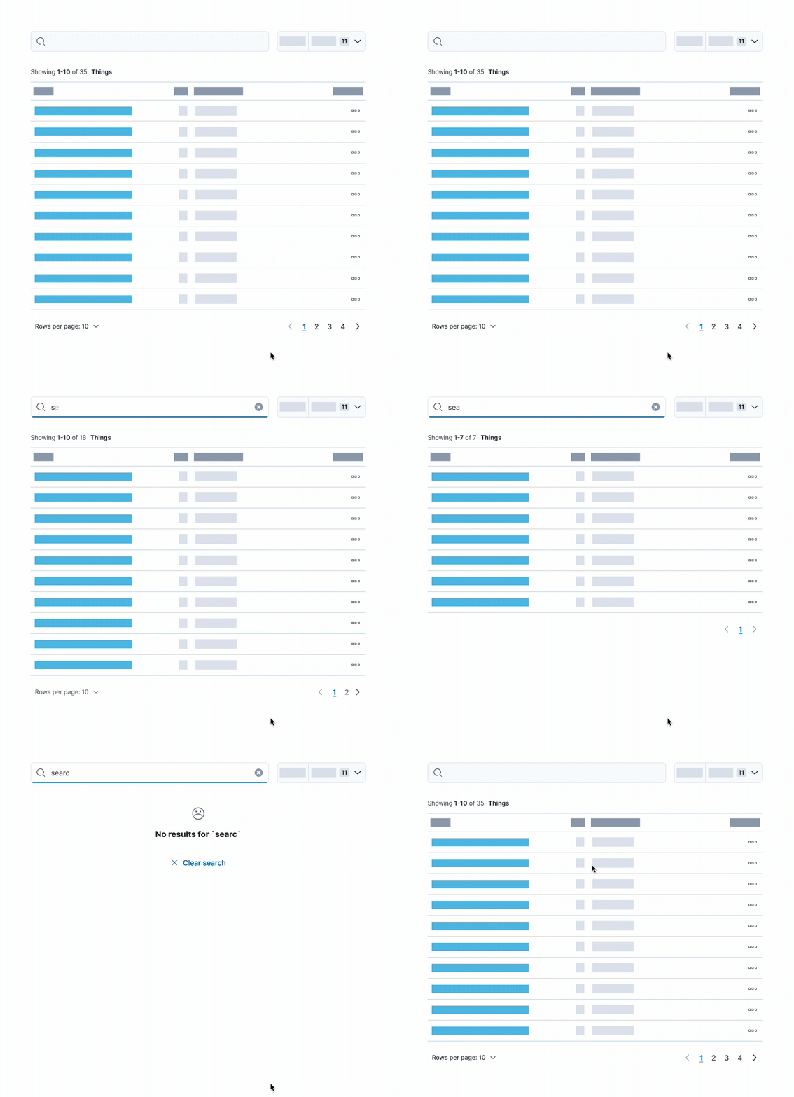
Display total results separately
When possible, always present a clear indicator of how many (and if not all results) have been returned. Just a simple count will do. Including a detailed summary of results at the top of the table or list goes a long way to signify what paging can’t.
Indicate indeterminate results
If you cannot provide a concrete number of results, you still have to communicate what the current results showcase. For instance, say "Showing first 100 results" or "Search results maxed at 1000" or "Results fetched at runtime".
Remember that not all users understand how your data API works. They just care about the data that's being shown to them.
Give users control
Providing a “Rows per page” option is often helpful enough to provide users control over the amount of data they see at once.
Keep the choices simple and only show “Rows per page” if there are more rows than the smallest option. For example, if there are only 9 rows and the smallest option is 10 rows per page, hide the selector.
Do: For shorter sets of data, you may want to include an “Show all” option.
Don't: Overload the user with choices, stick to only 2-3 options.
Optimize defaults
Most users don’t customize the default view. Therefore, it’s vital that you provide optimal defaults and reduce complexity as the number of entries increase. This means choosing a default “Rows per page” that best corresponds to the total results. For instance, 1000+ results shouldn’t start with 10 rows per page, but rather 20 or 50.
Here are some samples of what controls to provide based on the number of data entries.
Total entries | Rows per page options | Pagination style |
|---|---|---|
Total entries 0 | Rows per page options Use EuiEmptyPrompt in place of table | Pagination style N/A |
Total entries Less than 50 | Rows per page options Show 10, but allow All | Pagination style |
Total entries 51 - 100 | Rows per page options 10, 20, All | Pagination style |
Total entries 101 - 200 | Rows per page options 10, 20, 50 | Pagination style |
Total entries More than 200 | Rows per page options 20, 50, 100 | Pagination style |
Total entries Unknown | Rows per page options Depends on what you expect the total entries to be | Pagination style |
If the total results are unknown, you can make a best guess based on the context of that specific table, whether there’s most likely going to be tens or thousands of results. From there you can decide to show 10 rows per page or 20 by default.
The complexity of the data will also contribute to this equation, which is why the table above is just a sample.
Preserve the user-customized state of pagination
When providing pagination, customizable display options, and data filters, always save the user’s state in some form. This is especially important if your data includes links that navigate a user away from the current view. There’s nothing more frustrating for users than going back to find their filters and pagination have been reset.
Below is a working example that utilizes localStorage to save the table’s state.
Avoid infinite scrolling
Infinite scrolling, i.e. loading data as the user scrolls, is the exact opposite of being able to save the user’s pagination state. As soon as they navigate away from the page, their position in the list is lost. It’s better to increase the quantities of rows per page or provide a “Load more” action.
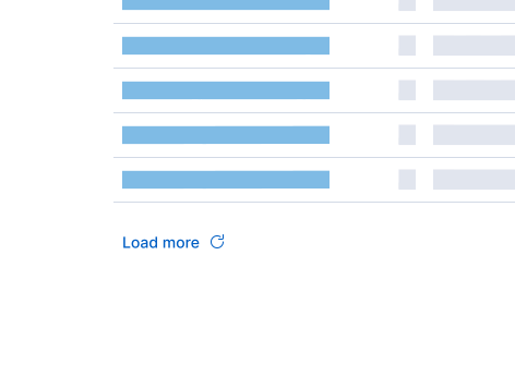
Do: Provide a direct action for users to initiate the loading of more data.
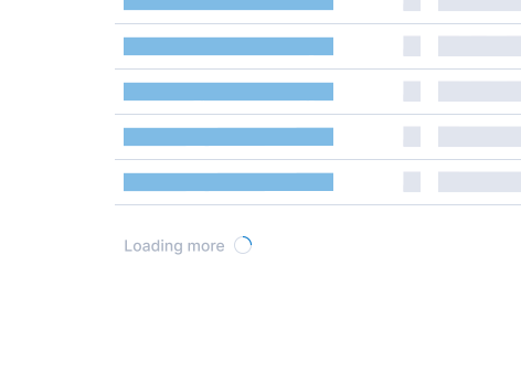
Don't: Use infinite scroll to automatically load more rows of data.
Props
EuiPagination
Prop | Description and type | Default value |
|---|---|---|
Prop className# | Description and type Type: string | Default value |
Prop aria-label# | Description and type Defines a string value that labels the current element. string | Default value |
Prop data-test-subj# | Description and type Type: string | Default value |
Prop css# | Description and type Type: Interpolation<Theme> | Default value |
Prop pageCount# | Description and type The total number of pages. number | Default value 1 |
Prop activePage# | Description and type The current page using a zero based index. number | Default value 0 |
Prop onPageClick# | Description and type Click handler that passes back the internally calculated (pageIndex: number) => void | Default value () => {} |
Prop compressed# | Description and type If true, will only show next/prev arrows and simplified number set. boolean | Default value |
Prop responsive# | Description and type Automatically reduces to the false | string[] | Default value ['xs', 's'] |
EuiPaginationButton
Prop | Description and type | Default value |
|---|---|---|
Prop pageIndex# | Description and type Type: number | Default value Required |
Prop color# | Description and type Any of the named color palette options. Do not use the following colors for standalone buttons directly,
"text" | "accent" | "accentSecondary" | "primary" | "success" | "warning" | "danger" | "neutral" | "risk" | Default value |
Prop size# | Description and type Type: "s" | "xs" | "m" | Default value |
Prop flush# | Description and type Ensure the text of the button sits flush to the left, right, or both sides of its container "left" | "right" | "both" | Default value |
Prop isLoading# | Description and type Force disables the button and changes the icon to a loading spinner boolean | Default value |
Prop isSelected# | Description and type Applies the boolean state as the boolean | Default value |
Prop href# | Description and type Type: string | Default value |
Prop target# | Description and type Type: string | Default value |
Prop rel# | Description and type Type: string | Default value |
Prop type# | Description and type Type: "reset" | "submit" | "button" | Default value |
Prop buttonRef# | Description and type Type: Ref<HTMLAnchorElement | HTMLButtonElement> | Default value |
Prop contentProps# | Description and type Object of props passed to the CommonProps & EuiButtonDisplayContentType | Default value |
Prop iconType# | Description and type Any IconType | Default value |
Prop iconSide# | Description and type Can only be one side ButtonContentIconSide | Default value |
Prop textProps# | Description and type Object of props passed to the This span wrapper can be removed by passing false | (HTMLAttributes<HTMLSpanElement> & CommonProps & { ref?: Ref<HTMLSpanElement>; 'data-text'?: string; }) | Default value |
Prop iconSize# | Description and type Type: "s" | "m" | Default value |
Prop isDisabled# | Description and type Type: boolean | Default value |
Prop className# | Description and type Type: string | Default value |
Prop aria-label# | Description and type Defines a string value that labels the current element. string | Default value |
Prop data-test-subj# | Description and type Type: string | Default value |
Prop css# | Description and type Type: Interpolation<Theme> | Default value |
Prop hasAriaDisabled# | Description and type NOTE: Beta feature, may be changed or removed in the future Changes the native Use e.g. when a disabled button should have a tooltip. boolean | Default value |
Prop onClick# | Description and type Type: MouseEventHandler<HTMLAnchorElement> | MouseEventHandler<HTMLButtonElement> | (MouseEventHandler<HTMLButtonElement> & MouseEventHandler<...>) | (MouseEventHandler<...> & MouseEventHandler<...>) | Default value |
Prop isActive# | Description and type Type: boolean | Default value |
Prop totalPages# | Description and type Type: number | Default value |
EuiTablePagination
Prop | Description and type | Default value |
|---|---|---|
Prop showPerPageOptions# | Description and type Option to completely hide the "Rows per page" selector. boolean | Default value true |
Prop itemsPerPage# | Description and type Current selection for "Rows per page". number | Default value 10 |
Prop itemsPerPageOptions# | Description and type Custom array of options for "Rows per page". number[] | Default value [10, 25, 50] |
Prop onChangeItemsPerPage# | Description and type Click handler that passes back selected ItemsPerPageChangeHandler | Default value |
Prop onChangePage# | Description and type Type: (pageIndex: number) => void | Default value |
Prop aria-controls# | Description and type Requires the string | Default value |
Prop aria-label# | Description and type Type: string | Default value |
Prop responsive# | Description and type Automatically reduces to the false | string[] | Default value |
Prop compressed# | Description and type If true, will only show next/prev arrows and simplified number set. boolean | Default value |
Prop pageCount# | Description and type The total number of pages. number | Default value |
Prop activePage# | Description and type The current page using a zero based index. number | Default value |